Posts

Showing posts from March, 2024

LIS 4317: Module # 11 Assignment

Image
  Module # 11 Assignment I created a marginal histogram scatter plot for this assignment using R and the ggplot2 program. ggplot2 and ggExtra were among the packages I first loaded and installed. Next, I generated statistics that showed annual budget expenditures per capita. The scatter plot was then created using ggplot2, maintaining a basic style, and adding a linear regression line for trend visualization. ggExtra's ggMarginal function was utilized to add marginal histograms to the plot. The histogram type of marginal plots was specified, and their presence was guaranteed on both axes.  This procedure made it possible to create a thorough visualization that combined summaries of the marginal distribution with insights from scatter plots, enabling a deeper comprehension of the properties of the data.

LIS 4370: Module # 11 Debugging and defensive programming in R

  Module # 11 Debugging and defensive programming in R Bugged Code: tukey_multiple <- function(x) {    outliers <- array(TRUE,dim=dim(x))    for (j in 1:ncol(x))     {     outliers[,j] <- outliers[,j] && tukey.outlier(x[,j])     } outlier.vec <- vector(length=nrow(x))     for (i in 1:nrow(x))     { outlier.vec[i] <- all(outliers[i,]) } return(outlier.vec) } Corrected Code: tukey_multiple <- function(x) {   outliers <- array(FALSE, dim = dim(x))  # Corrected initialization   for (j in 1:ncol(x)) {     outliers[, j] <- tukey.outlier(x[, j])  # Corrected logic   }   outlier.vec <- vector(length = nrow(x))   for (i in 1:nrow(x)) {      outlier.vec[i] <- any(outliers[i, ])  # Corrected logic   }    return(outlier.vec)  } Explanation: Immediately as I looked over the code, I saw that the loop's upd...

LIS 4317: Module # 10 assignment

Image
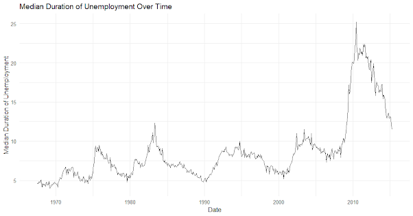
  Module # 10 assignment Time series data is important in many fields, such as finance, economics, and weather forecasting. It is defined as observations taken at repeated time intervals. Finding patterns, drawing conclusions, and coming to wise decisions all depend on the visualization of such data. First, we take a look at the 'economics' dataset that is integrated into ggplot2, which includes economic indicators for a number of years. This dataset contains variables like population, unemployment rate, and median length of unemployed. Using a time series graphic of the unemployment rate, we first investigate patterns and variations in the dataset.  By charting the median length of unemployment across time, we can see possible long-term trends or seasonal patterns. Furthermore, we explore combination visualization methods, comparing and contrasting several time series plots for investigation of correlation or comparability. The flexible framework of ggplot2 allows analysts an...

LIS 4370: Module # 10 Building your own R package

Module # 10 Building your own R package  GitHub Link:  https://github.com/agremer/LIS4370/blob/main/DESCRIPTION%20File DECRIPTION File : Package : DataVisTools Title : Alec Gremer's Data Visualization Test Implementation Version : 0.1.0.9000 Authors@R : "Alec Gremer, agremer@usf.edu [aut, cre]" Description : DataVisTools is an R package designed to streamline data visualization tasks by offering a versatile set of functions. It will include interactive visualization features, customizable plot aesthetics, statistical visualization tools, geospatial mapping capabilities, and time series analysis functions. Comprehensive documentation and an MIT License will ensure ease of use and widespread adoption. Implementation will prioritize S3 classes and methods for flexibility.  Depends : R (>= 3.1.2) License : CC0 LazyData : true For the final project, I proposed an R package named DataVisTools, which will serve as a comprehensive toolkit for data visualization tasks. Thi...

LIS 4370: Module # 9 Visualization in R

Image
Module # 9 Visualization in R  The dataset I chose to present for this assignment was based off of the total amount of Florida Voting Records by county, saved as "Florida.csv". Base R Graphics (Bar plot): Without the need for any additional packages, this kind of plot may be made with simple R functions. It can be easily created and is appropriate for basic visualizations. The graphic makes it simple to compare the total votes across different counties by displaying the votes by county using bars. But in comparison to other packages, there aren't as many choices for customization. Lattice Package (Dot plot): Plotting may be done using Lattice thanks to its high-level interface. In contrast to bars, which can be more difficult to read when dealing with a large number of categories, the dot plot displays the distribution of total votes by county using dots. Compared to base R graphics, Lattice provides greater customization options for the plot's design and arrangement....

LIS 4317: Module #9 assignment

Image
 LIS 4317: Module #9 assignment The following matrix was constructed in ggplot2 using the 'iris' dataset: Each plot in this scatterplot matrix is a combination of the two variables, sepal length and sepal width. We can compare the connections between variables across different species of iris by faceting the data points according to their species. The 5 principles of design for this visualization that have been implemented in this graph have: Ensured proper alignment of axis labels, data points, and facets to create a sense of order and organization in the plot. Each plot in the matrix was aligned properly with consistent axis labels. Repeated design elements such as axis labels and facetting to create consistency and coherence throughout the visualization. Consistency in representation helped viewers understand the relationships between different variables and categories. Utilized contrast to highlight important elements and relationships. Different colors were used for differ...