Wednesday, March 20, 2024

LIS 4317: Module # 10 assignment


Module # 10 assignment


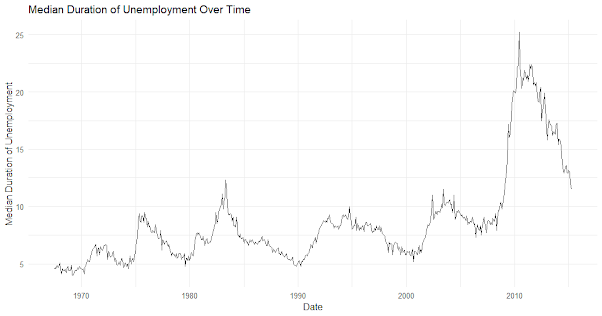
Time series data is important in many fields, such as finance, economics, and weather forecasting. It is defined as observations taken at repeated time intervals. Finding patterns, drawing conclusions, and coming to wise decisions all depend on the visualization of such data. First, we take a look at the 'economics' dataset that is integrated into ggplot2, which includes economic indicators for a number of years. This dataset contains variables like population, unemployment rate, and median length of unemployed. Using a time series graphic of the unemployment rate, we first investigate patterns and variations in the dataset. 


By charting the median length of unemployment across time, we can see possible long-term trends or seasonal patterns. Furthermore, we explore combination visualization methods, comparing and contrasting several time series plots for investigation of correlation or comparability. The flexible framework of ggplot2 allows analysts and researchers to obtain deeper insights into the dynamics of time-dependent phenomena, which improves forecasting and decision-making in a variety of disciplines. 


These visualizations enable audiences to confidently and clearly navigate complicated temporal environments by revealing the underlying narratives hidden behind time series data.

Saturday, March 16, 2024

LIS 4370: Module # 10 Building your own R package


Module # 10 Building your own R package 


GitHub Link: https://github.com/agremer/LIS4370/blob/main/DESCRIPTION%20File

DECRIPTION File:


Package: DataVisTools

Title: Alec Gremer's Data Visualization Test Implementation

Version: 0.1.0.9000

Authors@R: "Alec Gremer, agremer@usf.edu [aut, cre]"

Description: DataVisTools is an R package designed to streamline data visualization tasks by offering a versatile set of functions. It will include interactive visualization features, customizable plot aesthetics, statistical visualization tools, geospatial mapping capabilities, and time series analysis functions. Comprehensive documentation and an MIT License will ensure ease of use and widespread adoption. Implementation will prioritize S3 classes and methods for flexibility. 

Depends: R (>= 3.1.2)

License: CC0

LazyData: true


For the final project, I proposed an R package named DataVisTools, which will serve as a comprehensive toolkit for data visualization tasks. This package will offer a range of functions designed to simplify the process of creating informative and visually appealing plots for exploratory data analysis and presentation purposes. Key features of DataVisTools will include interactive visualization functions leveraging Plotly and ggplot2, customization options for plot aesthetics, statistical visualization tools such as histograms and box plots, geospatial visualization capabilities for mapping data points, and time series visualization functions for analyzing trends and seasonality. To ensure usability and clarity, DataVisTools will come with thorough documentation, including long-form vignettes and metadata. The package will be released under the CC0 License, allowing for free use, modification, and distribution while maintaining proper attribution. Implementation will primarily utilize S3 classes and methods for flexibility and simplicity.

Monday, March 4, 2024

LIS 4370: Module # 9 Visualization in R


Module # 9 Visualization in R 


The dataset I chose to present for this assignment was based off of the total amount of Florida Voting Records by county, saved as "Florida.csv".


Base R Graphics (Bar plot):

Without the need for any additional packages, this kind of plot may be made with simple R functions. It can be easily created and is appropriate for basic visualizations. The graphic makes it simple to compare the total votes across different counties by displaying the votes by county using bars. But in comparison to other packages, there aren't as many choices for customization.


Lattice Package (Dot plot):

Plotting may be done using Lattice thanks to its high-level interface. In contrast to bars, which can be more difficult to read when dealing with a large number of categories, the dot plot displays the distribution of total votes by county using dots. Compared to base R graphics, Lattice provides greater customization options for the plot's design and arrangement.


ggplot2 Package (Box plot):

Because of its language of graphics approach, ggplot2 is a well-liked and robust software for making graphics in R. Using the median, quartiles, and any outliers displayed, the box plot illustrates the distribution of total votes by county. With ggplot2, users may build highly customizable, publication-quality plots thanks to its vast customization possibilities. It has a tiered approach, which makes it simple to enhance interpretation by adding more layers to the story.


In terms of user-friendliness, personalization choices, and plotting possibilities, each package has advantages and disadvantages that vary. Advanced customization is absent from Base R graphics, which are straightforward and simple to utilize. With lattice, you may plot higher-level functions with more flexibility. For making intricate and visually appealing plots, ggplot2 is the best solution due to its wide range of customization options. The particular needs and tastes of the user determine which package to select.

LIS 4317: Module #9 assignment


 LIS 4317: Module #9 assignment


The following matrix was constructed in ggplot2 using the 'iris' dataset:


Each plot in this scatterplot matrix is a combination of the two variables, sepal length and sepal width. We can compare the connections between variables across different species of iris by faceting the data points according to their species.


The 5 principles of design for this visualization that have been implemented in this graph have:

Ensured proper alignment of axis labels, data points, and facets to create a sense of order and organization in the plot. Each plot in the matrix was aligned properly with consistent axis labels.

Repeated design elements such as axis labels and facetting to create consistency and coherence throughout the visualization. Consistency in representation helped viewers understand the relationships between different variables and categories.

Utilized contrast to highlight important elements and relationships. Different colors were used for different species of iris to distinguish between them easily. This helped viewers identify patterns specific to each species.

Grouped related elements together to improve readability and comprehension. Data points representing the same species were grouped together within each facet. This proximity allowed viewers to compare the relationships between variables within each species.

Distributed elements evenly throughout the visualization to create a sense of equilibrium. Each facet in the scatterplot matrix contained enough data points to provide meaningful insights, and the visual weight of the plot was balanced by adjusting the size and spacing of facets.

Thursday, February 29, 2024

LIS 4370: Module # 8 Input/Output, string manipulation and plyr package


Module # 8 Input/Output, string manipulation and plyr package


Effective data manipulation and analysis approaches are demonstrated by R code, which provides a comprehensive solution for handling datasets. It starts by utilizing the read.table() API to let the user import any dataset they want. The code computes the average grade for every gender category by utilizing the plyr package, and then stores the results in a new dataframe. Next, using the write.table() function, the outcomes are recorded to a CSV file called "Sorted_Average.csv". Furthermore, the code effectively uses the grepl() and subset() functions to filter the dataset such that it only keeps the items whose names begin with the letter 'i,' regardless of case. Users can then access a refined dataset that meets particular criteria by writing the filtered subset that was produced to a different CSV file called "DataSubset.csv."


With a focus on readability and modularity, this code embodies a solid method for data analysis and manipulation in R. The code enhances efficiency and facilitates further data exploration and interpretation by optimizing the importing, analyzing, and filtering processes of datasets through the integration of essential functions from frequently used packages like plyr. It is a useful tool for data scientists and analysts who want to glean insights from a variety of datasets because of its well-organized structure and distinct task division, which cater to users with different skill levels.

LIS 4317: Module # 8 Correlation Analysis and ggplot2


Module # 8 Correlation Analysis and ggplot2


In visual data representations, Few's guidelines place a strong emphasis on correctness, simplicity, and clarity. The data visualization community holds Few's principles in high regard, and they have had a big impact on how data is displayed and understood.


The finest techniques in data visualization align well with Few's emphasis on clarity and simplicity. His guidelines assist guarantee that data visualizations are comprehensible and accessible to a broad audience by emphasizing the conveying of important insights and reducing needless visual clutter. The emphasis on accuracy also highlights how crucial it is to convey data honestly and steer clear of deceptive representations.

Thursday, February 22, 2024

LIS 4370: Module # 7 R Object: S3 vs. S4 assignment


 Module # 7 R Object: S3 vs. S4 assignment


Using variables like mpg, cyl, disp, horsepower, and others, I was able to get data on different automobile models using the "mtcars" dataset in R. It is basically a data frame with rows denoting various automobile models and columns denoting their respective properties. 

The mtcars dataset is suitable for generic functions. On this dataset, you can construct functions that do tasks like generating summaries of statistics, creating visualizations, or conducting analyses.

The mtcars dataset cannot be directly assigned with S3 or S4 items. R's S3 and S4 systems are object-oriented programming environments where classes and methods for objects are defined. The mtcars dataset lacks a defined class structure and is instead a data frame.


How do you tell what OO system (S3 vs. S4) an object is associated with?

The class() function can be used to find the OO system linked to an object. The class or classes from which the object is derived will be returned. A class of "S4", for instance, is associated with S4, and a class of "S3" is related with S3.


How do you determine the base type (like integer or list) of an object?

The R typeof() function can be used to find the base type of an object. The object's type is indicated by the string that is returned.


What is a generic function?

In R, a function that has many implementations based on the type of arguments it receives is called a generic function. It gives various object types a common interface via which to carry out comparable functions. To alter the behavior of the generic function, users can define methods for various classes.


What are the main differences between S3 and S4?

S3: The class attribute of the object determines how methods are defined and called. Although formal class definitions and method signatures are absent, it is flexible and straightforward to use.

S4: It permits multiple inheritance and requires specific class definitions. Methods are declared explicitly and are called according to the object's class and method signature. Although more complex at times, it provides improved order and control.


“Ethical Concerns on the Deployment of Self-driving Cars”: A Policy and Ethical Case Study Analysis

Alec Gremer University of South Florida LIS4414.001U23.50440 Information Policy and Ethics Dr. John N. Gathegi, June 12th, 2023 “The Ethical...